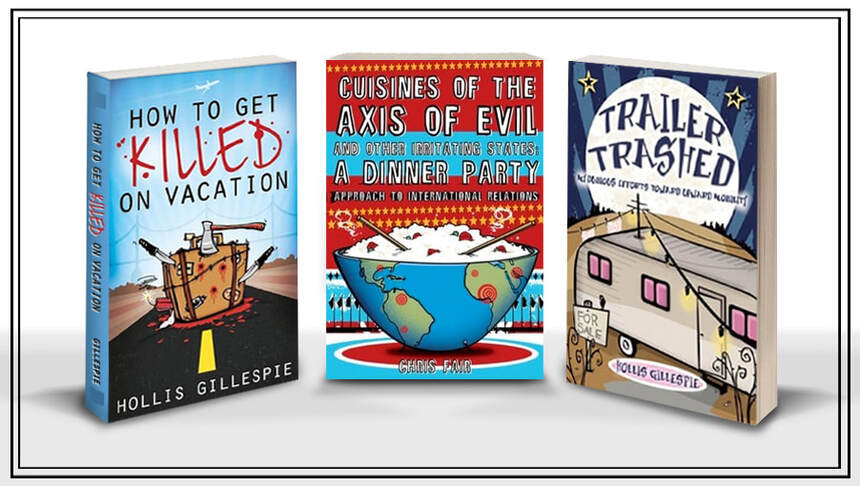
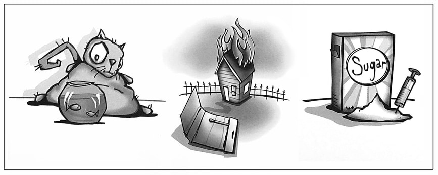
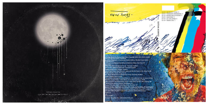
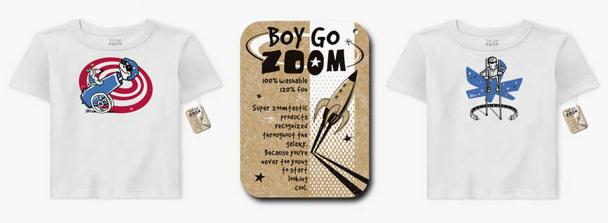
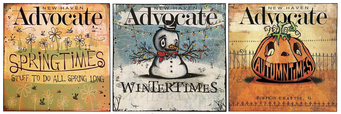
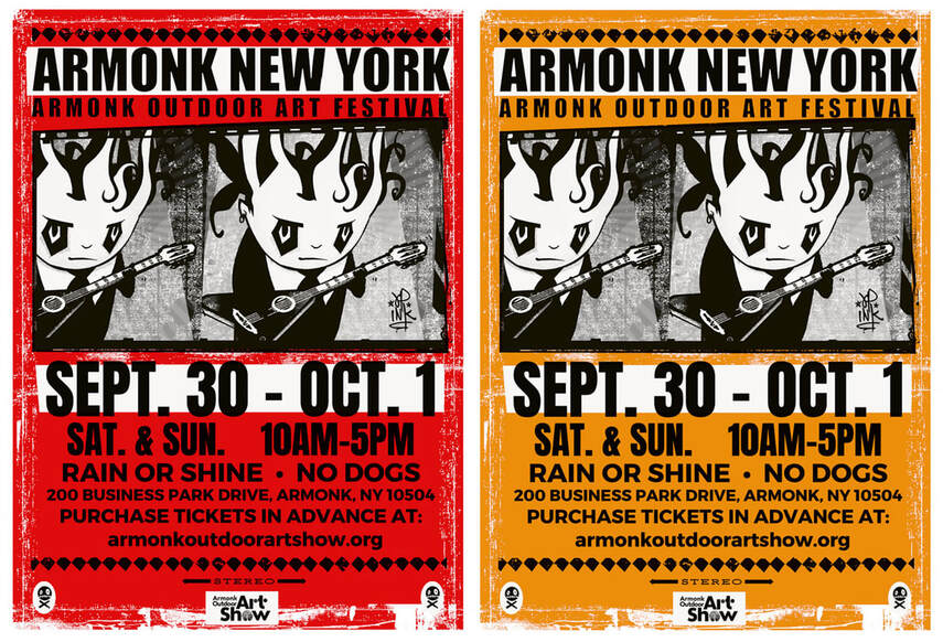
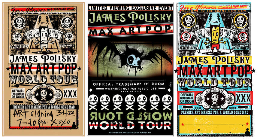
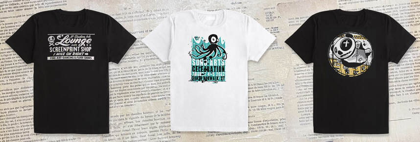
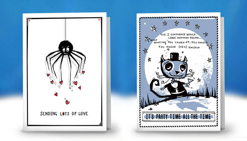
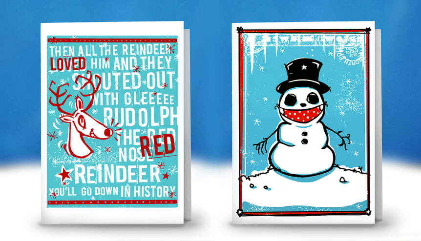
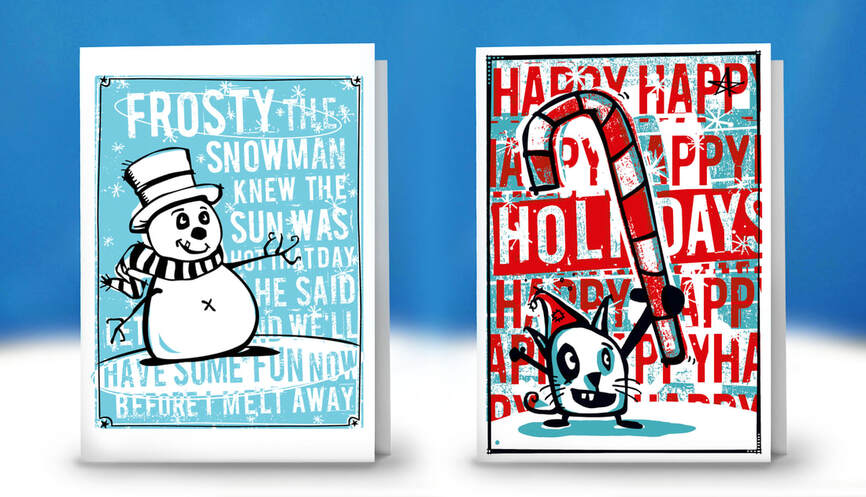
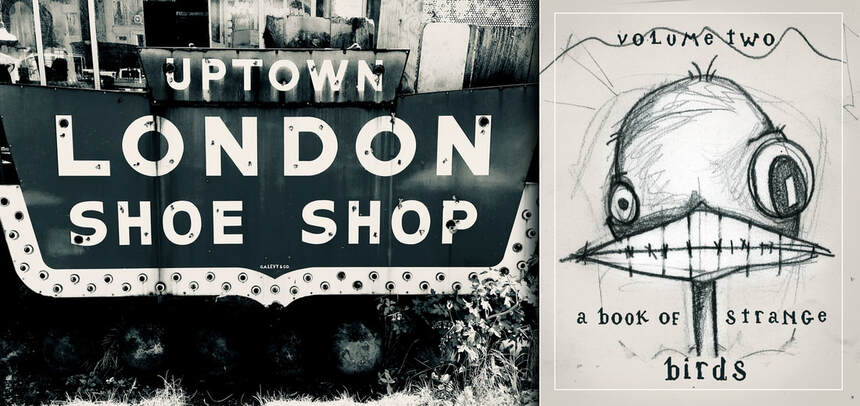
Things I LOVE to do... Book covers, indie paper covers, wallpaper design / color separation, band design and promotion,
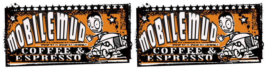
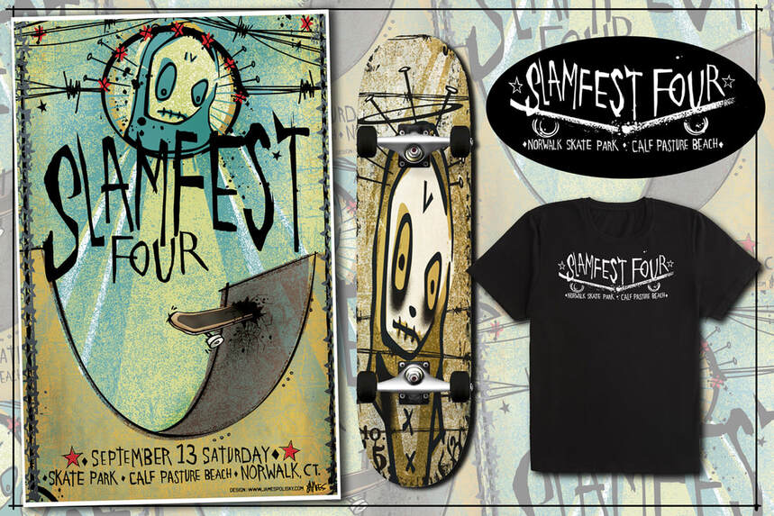
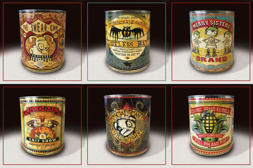
greeting cards and event posters, craft beer can labels, logos, etc.
Things I do NOT love... unfocused projects and endless revisions. Got something in mind? Feel free to give me a shout.
greeting cards and event posters, craft beer can labels, logos, etc.
Things I do NOT love... unfocused projects and endless revisions. Got something in mind? Feel free to give me a shout.